Tikkurila Oyj has renewed its logo, packaging for paints and coatings and its entire corporate image. Subtle changes were made to the logo to give it a more modern touch, but the crown motif remains the dominating visual element, as it has been for decades. The bright red color, which has been Tikkurila's hallmark for dozens of years, will also retain its place in the corporate image. With the renewal, the crown logo will be the identifying emblem of the entire Tikkurila Group, rather than just being a paint brand. The change takes place on October 1, 2014.
"A crown is a traditional symbol for quality, and as such, it makes an excellent logo for a company such as Tikkurila, which is a forerunner in its field and a strong market leader," says Erkki Järvinen, Tikkurila's President and CEO.
"The previous time our logo was given a facelift was in the late 1990s. This time, the crown logo and the typography of Tikkurila's name were given a softer, more modern and more accessible form. In addition to the crown - a symbol of status and dignity - the new logo also displays Tikkurila's own red color, which dates back to 1948. A red color will catch the eye. It has stopping power, it radiates strength and exudes confidence," says Minna Ihamäki-Laitinen, responsible person for the paint brand, commenting the renewal.
A new look and feel for the packaging, with some products delivered in plastic cans
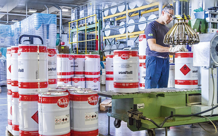
In addition, the packaging for paints and coatings of the Tikkurila brand has been renewed. The new packaging stands out in stores, making it easy for customers looking for this particular brand and quality to find. Strong colors and symbolic figures were chosen to be displayed on the packaging. Key product arguments are placed next to product names, with the important elements having been eliminated. This will help both the customers and the sales personnel to identify the products and choose the right product for the right purpose. The renewed look and feel of the packaging already includes the warning labels stipulated in the new EU regulations, to become effective in June 2015.
Water-borne interior paints will be delivered in plastic cans. Such cans have many advantages: they are light to transport and move and they are durable and resistant to impacts during transport. The new packaging was well received in tests with participants representing both paint retailers and end users. Tikkurila has also developed, in collaboration with packaging suppliers, a new lid, suitable for plastic cans, which enables the paint to be tinted without removing the lid, as was the case previously. This metal lid with a plastic rim is easy to remove and replace without tools, a long-awaited feature by the consumers in particular.
All in all, Tikkurila's redesigned logo and packaging send a message of a company that is strong, listens to its customers and keeps abreast with the time. The renewed packaging and other material will be available in selected stores in October.
Tikkurila's new corporate image and packaging were designed by Pentagon Design Oy, a Finnish design agency, with which Tikkurila has been engaged in collaboration for years.
For 150 years already, Tikkurila has provided consumers and professionals with user-friendly and sustainable solutions for surface protection and decoration. Tikkurila wants to be the leading paint company in the Nordic area as well as in Russia and other selected Eastern European countries. - Tikkurila inspires you to color your life.


